ARDCOM
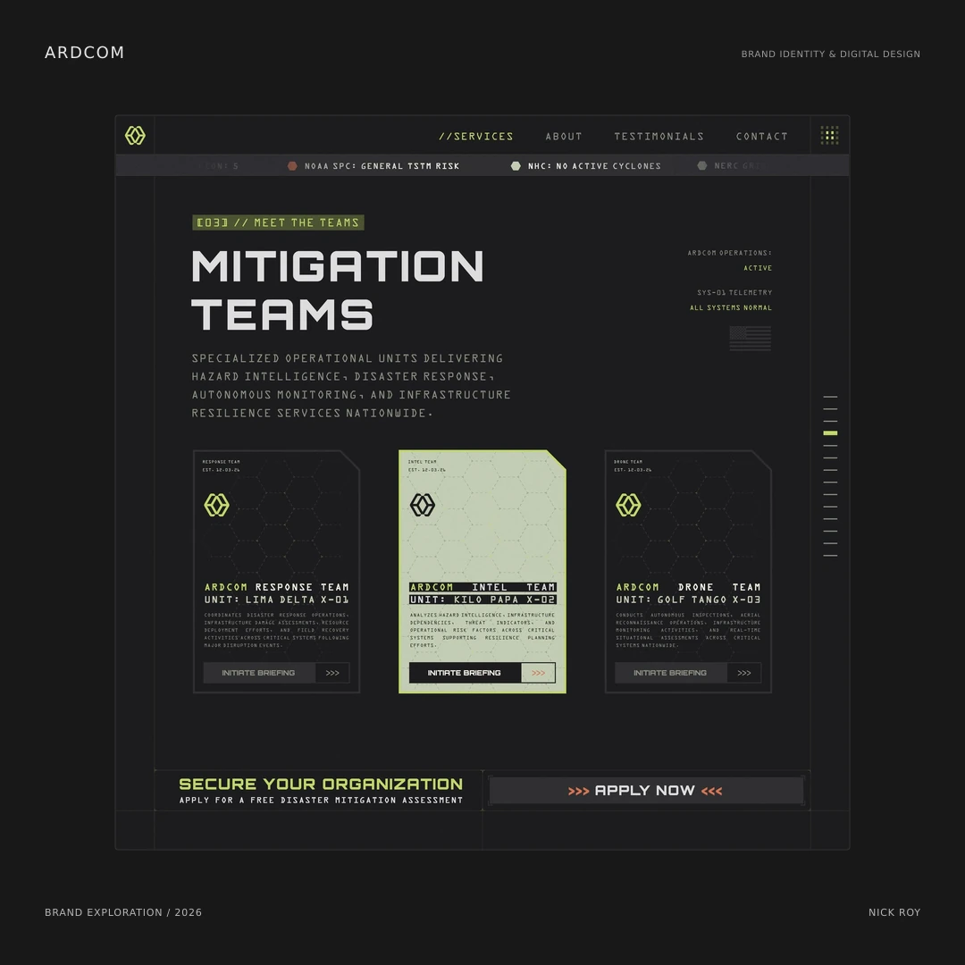
A disaster-mitigation brand exploration connecting a geometric logo with technical typography, green accents, team-card studies, and a website composition.
The artifact set
ARDCOM is a brand exploration for a disaster-mitigation company. The supplied work includes a geometric logo presentation, three team-card compositions, and a website study. Together, the artifacts explore a technical, operational visual language across different formats.
The mark
Paired geometric outlines frame a central diamond-shaped space. The supplied presentation shows the symbol in both positive and reversed treatments, making its structure visible on light and dark backgrounds. Its repeated angles provide a starting point for the wider graphic language.
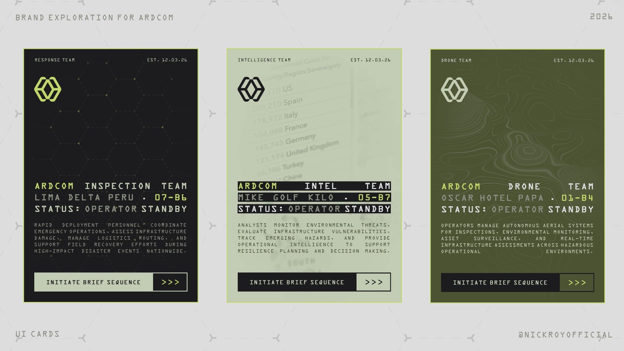
Team-card exploration. Repeated structure, technical typography, and variations in surface color connect the three compositions.
Open imageThe supporting direction
Green accents, dark surfaces, angular framing, and technical typography carry the identity into the team-card studies. The response, intelligence, and drone compositions share a consistent hierarchy while using different surface treatments and background details. The website study brings that system into a larger page composition, with a strong heading, team information, and a clear contact action.
Scope
Logo, brand artifacts, and interface exploration. This entry presents the supplied visual studies and their shared design direction.
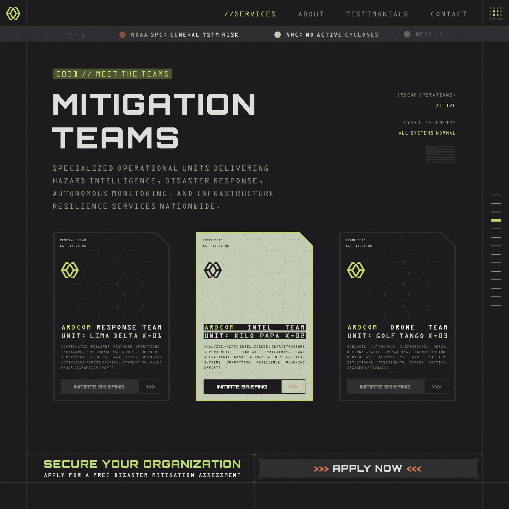
Website composition carrying the identity into navigation, typography, team cards, and a contact call to action.
Open image