Sleiport
Brand artifacts for a shipping company, pairing an angular identity with orange accents and detailed logistics-interface explorations in light and dark treatments.
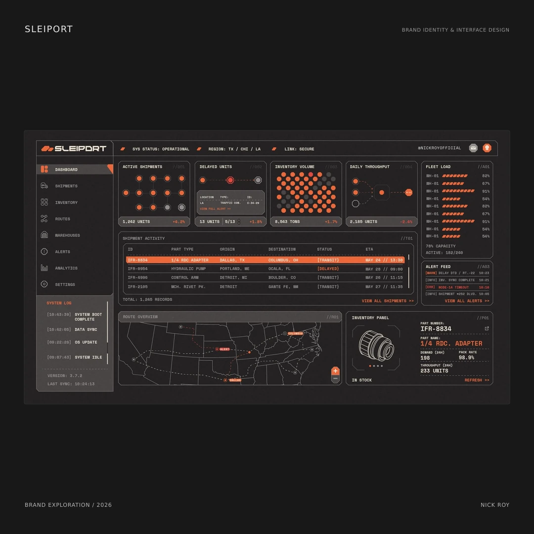
The artifact set
Sleiport is a shipping-company brand exploration presented through an identity board and two logistics-dashboard studies. The supplied pieces show how a recognizable visual direction can extend from a symbol and wordmark into an information-heavy interface.
The visual language
The orange symbol and angular wordmark establish the identity. Monospaced supporting type, fine rules, clipped corners, and small geometric markers give the presentation an industrial character. Orange connects the brand mark with highlighted information and selected states, rather than appearing only as a decorative accent.
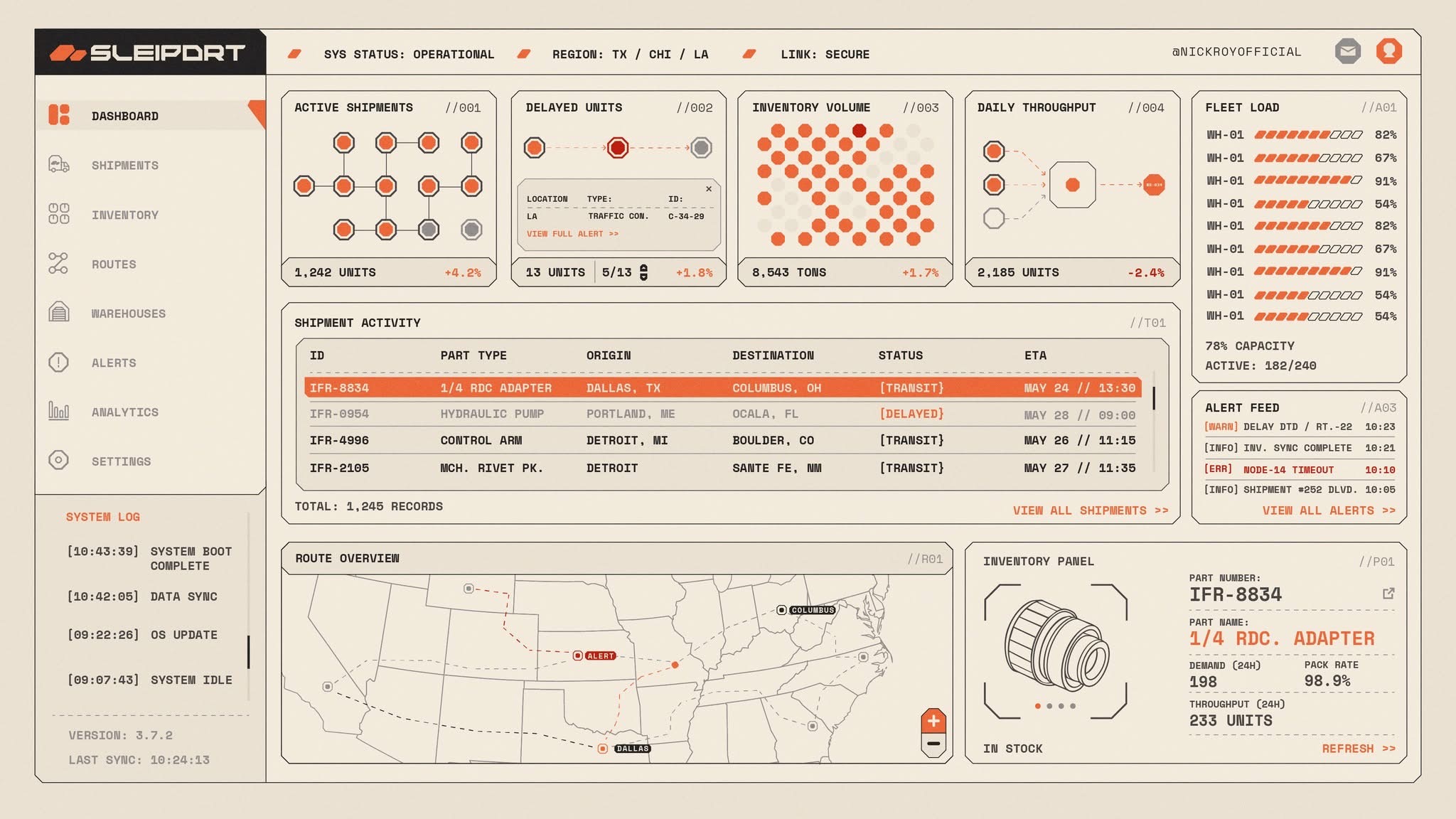
Light interface exploration. Clipped panel corners, technical labels, and orange highlights carry the identity into a dense logistics dashboard.
Open imageThe interface explorations
The dashboard studies bring shipment activity, routes, inventory, alerts, and fleet-load indicators into a consistent layout. A sidebar establishes the navigation, while the central panels give different kinds of information their own space. The light and dark versions keep that structure recognizable while changing the surface treatment.
Scope
Logo and visual identity exploration, with light and dark logistics-interface studies. This entry documents the supplied brand artifacts and design direction.
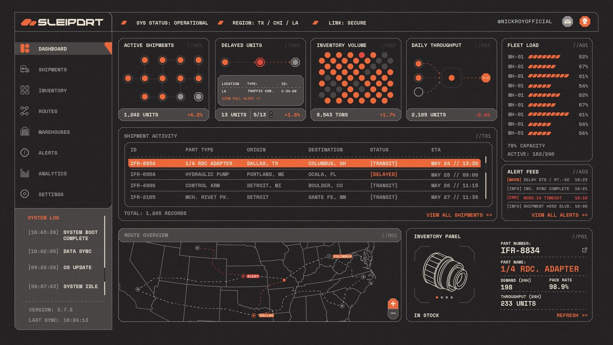
Dark interface exploration using the same layout and graphic language. The values and operational statuses belong to the supplied design study.
Open image